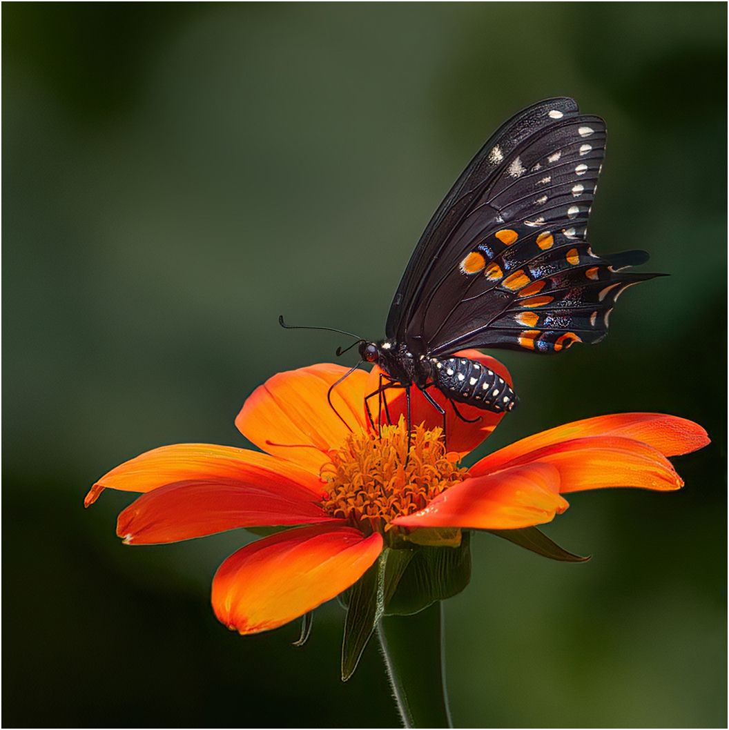
I am proud to present this image of a Swallowtail butterfly on a Tithonia flower, by Canadian photographer Patricia Griesser.
The most obvious Ingredient of this image is its nature story. But another is the combination of red and green which, in this image, makes for two types of colour harmony: the colour of the flower is repeated in the spots on the butterfly’s wings but red and green also happen to be complementary colours. These are colours situated opposite to each other on the colour wheel and they make for very pleasing images.
In terms of composition: one ingredient is the way the butterfly and flower are nicely balanced in the image space, but the most obvious Ingredient in that category is the delicious simplicity of the image. Simplicity is the cornerstone-ingredient of composition or ‘Visual Order’.
So, in one image we have six ingredients: a Nature Story, two types of Colour Harmony, Balance, Simplicity, and Visual Impact. That’s about as good as it gets. Thanks for your great contribution, Patricia.
